The smartphone OS market is rarely kind to things that try to be different so Microsoft should be lauded for taking a risk in bringing its unique Windows Phone 7 to the consumer, and Nokia in turn for choosing it as their flagship smartphone OS.

The User Interface of Windows Phone, codenamed Metro, is beautifully elegant and striking in its simplicity. Its design is very much centred around personal communication, integrating actions and content directly related to the user's primary tasks and personalised content with bold, confident typography. The hinged-door metaphor on which the UI is based is gorgeous in motion, and little flourishes show the amount of love put into its design. iOS and Android may perform well as mini computers, but Windows Phone is the only smartphone OS that has truly been designed primarily around the human need to communicate.
Embedded content: http://www.youtube.com/embed/locNEna0of4?rel=0
There is a completeness to the UI paradigm that makes designing for Windows Phone seem like an easy proposition. Using provided guidelines and the OS as an example it should be straightforward for individual designers and developers to create an application that is compliant and fits seamlessly into the Metro UI. Most of the hard work is done for you and there is little to worry about in terms of styling and layout.
However, it is this completeness that makes Metro an intimidating proposition for designers and brands alike. Mobile OSes these days live and die by how accommodating they are as platforms. Having a strong overarching system identity requires adherence to its principles for it to work platform wide, and these can be problematic for brands with strong, almost dictatorial visual identities and for designers and developers who use applications as showcases for personal creativity.
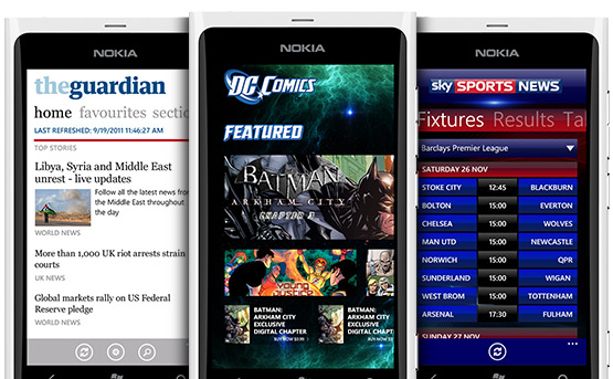
Brands such as The Guardian, DC Comics and Sky Sports have shown that it's possible to work within the Metro UI guidelines and still deliver an on-brand experience for Windows Phone 7.
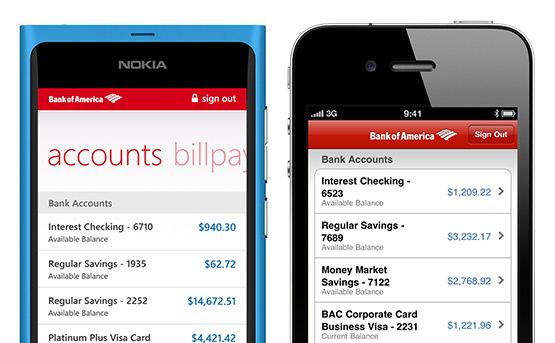
The strong typographic underpinning WP7 borrowed from Zune offers a better base to build an app from. Comparing the WP7 version of the Bank of America app to the iOS version, the WP7 version is clean and elegant, giving the user a sense of stability, whereas the iOS version is clunky and doesn't inspire the user with confidence. Both apps, as far as we can tell, use standard UI elements out of the box.

The Bank of America app is almost spartan in its design, but in this case the austerity works. Banking should be uncluttered, clean and simple. This fits with the Metro ethos of “no decoration, no ornamentation, no need”.
However, this modernist approach leads to the same issue that modernism in architecture and furniture has been accused of—it can be cold and inhuman. Unfortunately, this criticism can also be levelled at Metro.
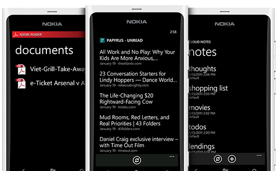
Metro's ascetic design leads to some apps consisting of black screens with white type. Besides the quality of the typography, this is little better than a Terminal window or an MS-DOS box. Adobe's Reader, Papyrus (an Instapaper client), Cloud Notes—these apps are all guilty of this. Simple and modern is admirable, but not at the expense of warmth.
The coldness of the aforementioned apps could have been rectified with something as simple as a background image which Metro does a wonderful job of animating with a parallax effect.
In Adobe Reader's case a background with the red curves that underpin Reader's identity would have helped lift it and give it a strong identity, for Papyrus a rendered view of the last read article would help bring the user into their content.
Little flourishes like this, in the spirit of the ones included by Microsoft in the design of the system, go a long way to adding warmth to WP7 apps. We need to keep warmth in mind when designing for Metro. As humans, warmth is ultimately what makes us relate to things and we're not merely readers and consumers of content, we're people too.
Here at ustwo™ it is important to both our clients and our ourselves that app experiences we create are unique and not homogenous, yet are also true to interaction styles and underlying conventions of the native platform. We will be looking very hard at the Metro UI to find where and when it is possible to show flair and creativity.
We’re setting this as a challenge to ourselves and other designers out there to not approach applications on the platform as simply trying to recreate what’s been done on iOS or Android or as just another lazy porting job. Wunderlist, whom we dearly love, is guilty of this and has greatly sacrificed the user experience on their Windows Phone app.
In the upcoming weeks, we’ll be reporting back on the second part of our journey as our visual, interaction, and developers see what it’s like to design for, port, and publish one of our own apps to the Windows Phone Marketplace.
Stay tuned, and wish us luck!
Thanks to Lawrence Kitson, David Fisher and Anthony Lui for providing the UX and UI input.