Over the last six months, ustwo™ Malmö has been working with Bank24.ru as part of a collaborative dream team, to help build a ground-breaking financial service for entrepreneurs in Russia. It was a truly exciting project to be involved with - we had a blank canvas to build something from scratch, a global team of best in class collaborators and a client who lived and breathed our JFDI approach.
We kicked off the project with a focus on entrepreneurs, and from this developed initial ideas for a service designed to help them run their businesses more efficiently. During early prototyping it became important that we defined exactly how the brand should be represented within the design.
The brand was in the process of being developed by Michael Wolff, NB Studio and Daljit Singh, so together we began exploring what it might look and feel like as part of a digital service. The digital brand had to be simple and easy enough for anyone to understand. The service was therefore named KNOPKA meaning button.
KNOPKA’s brand visual identity consisted of simple buttons, the Futura font and a rich palette of colours - kept flat, yet iconic. To mirror this, the UI design was stripped down removing unnecessary information, but it soon became clear that conveying the unique KNOPKA brand spirit through something so flat and simple would be challenging. To help us capture both an emotive experience and sense of brand ‘magic’, we brought together Michael Wolff, NB Studio and Daljit Singh for a one day emotive UI exploration workshop.
UI personality workshop
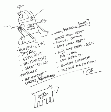
To begin with, we started discussing some examples of magical moments in life (like your first kiss or the smell of fresh coffee), and how these might translate into digital expressions. We then explored how the spirit of KNOPKA might manifest itself as a real character, for example a little cheeky girl, a faithful dog or a loving aunt.
The focus was not on what they looked like physically, but instead how they might behave or act in certain situations from sign in, to sharing news or displaying an error message. Throughout the process the different characters we came up with all consisted of unique elements that personified the core brand experience, but none of them captured the KNOPKA’ness we wanted within the UI.
After considering various options, it finally struck us that it was not a person or animal we were looking for, but instead the lovable R2-D2 from Star Wars. His characteristics matched the overall brand experience in all manners with key attributes including playfulness, loyalty, efficiency, cheekiness, trustworthiness, problem solving skills, message carrying, etc.
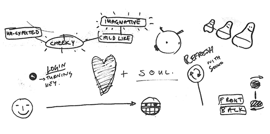
So with a character in mind, we sketched out some ideas in order to capture the spirit of R2-D2, and ways in which we could go about incorporating elements of this into the UI.
After the workshop we immediately began experimenting with different motion and interaction patterns, as well as sound effects to identify how best to represent R2-D2’s unique personality throughout the UI.
Bringing icons to life
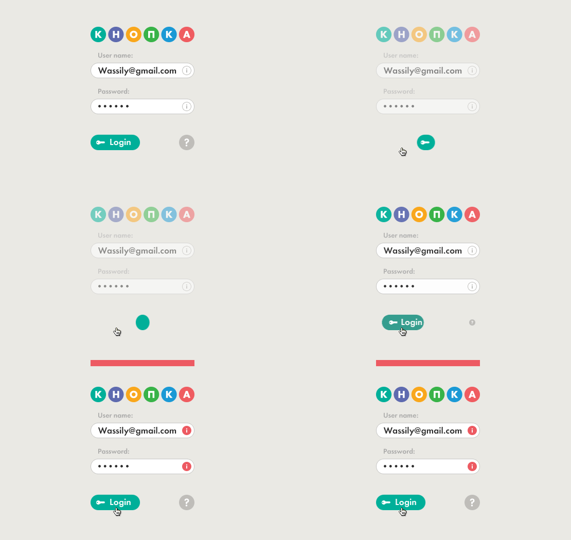
Since the UI was icon focused we really wanted to bring them to life with that extra KNOPKA character, and we did this by giving them their own individual animations. For example, the login button’s key icon spins when pressed, the money icon sparkles and the accountant icon blinks. This was a playful, subtle and engaging way of bringing some magic into the experience.
Emotion through motion
There’s no better way to express what’s going on in a UI than using motion design. A simple example of this is when there’s a failed attempt to login with the wrong password - the login button shakes and a specific yet subtle sound effect reiterates the issue. It’s similar to when R2D2 shuffles from side to side making his distinctive sound when he’s upset. 
Guiding the user through animations
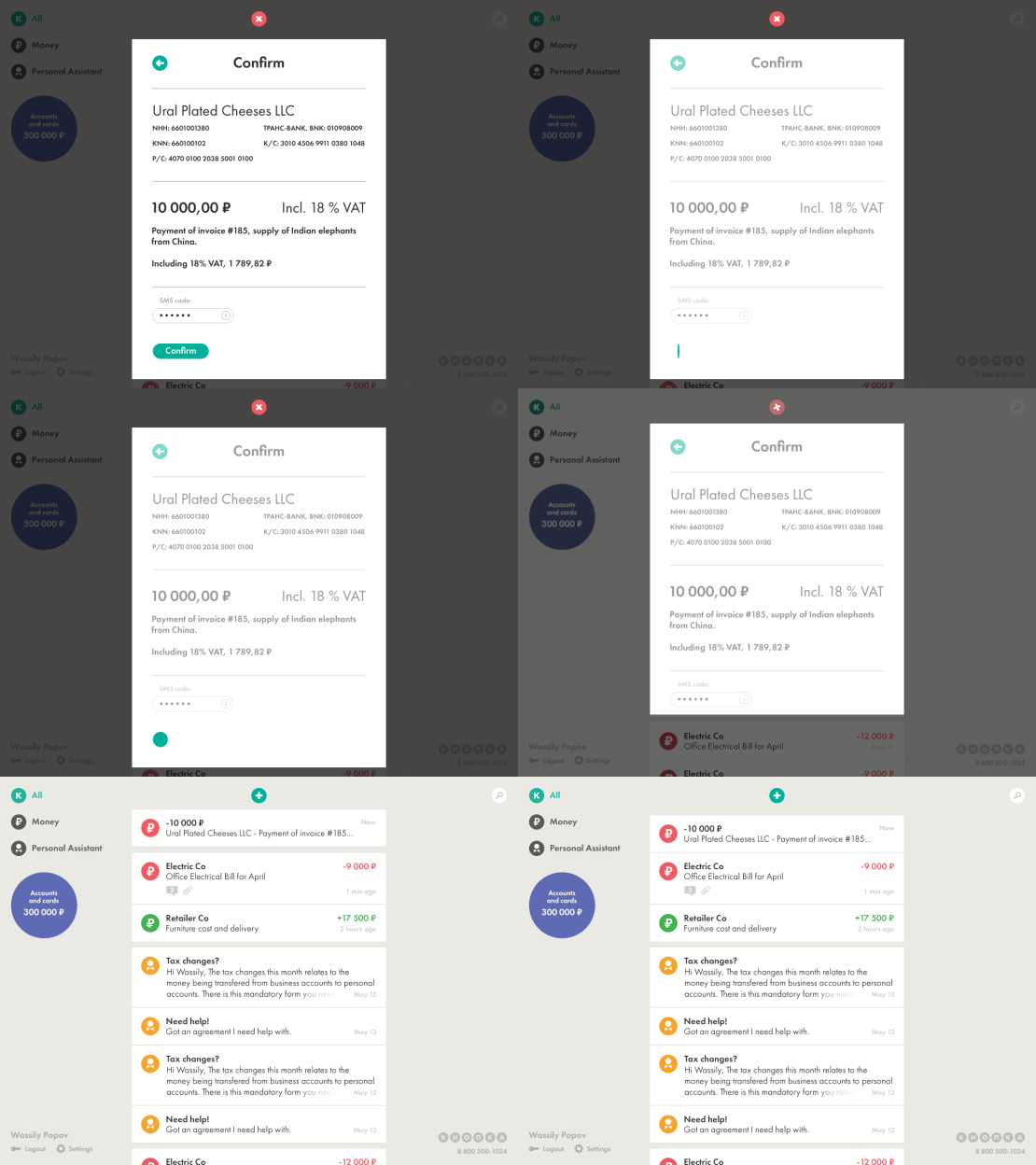
Something we value highly here is making sure a user really understands where they’re navigating to, where they came from, and even more importantly, where the things they’ve created end up within the UI. We’ve found that motion is an extremely powerful tool for helping users understand things as clearly as possible. 
Finding a balance
It’s really important to keep in mind that embodying the spirit of a unique character in a UI should be carefully considered. By overdoing it in certain instances you can hinder the user’s experience in completing a task. But there are occasions where overdoing it, may actually be just right.
Looking back at an exciting journey over the last six months we can only hope that one day you will sign up* for a KNOPKA account and literally start ‘feeling’ the KNOPKA brand.
- you will need to be able to understand Russian.
