A year ago ustwo™ released the hundred selling, million downloaded app for iPhone, HappySnapper.
HappySnapper was pitched as our “Anti-social Photosharing app”—a good half year before the original Color managed to make anti-social photosharing a $41 million joke without a punchline.
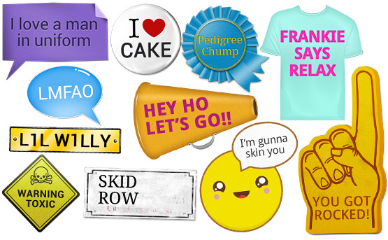
Our app encouraged users to take shots of their friends and “punk” them with goofy prop stickers and share them via Email, Twitter and Facebook.
Whilst HappySnapper never hit the critical mass we would have liked, its popularity exploded in Asia after we dropped the price to $0.00 and had it featured on FreeAppADay. This new-found popularity, coupled with the ever expanding Android userbase, led to us prepping an Android version.
Adapting the iOS UI to one which satisfies the Android HIG has been an enjoyable challenge, but a less enjoyable issue is the barebones approach to typography that the Open Handset Alliance has taken with Android.
HappySnapper's unique selling point was for users to be able to edit text on stickers to humour their friends. Because of the variety of stickers available, HappySnapper relies on different typefaces for its charm.
Below is a selection of HappySnapper stickers which are customised with fonts included on every iOS device shipped.

Below is the same selection customised with fonts that we can expect on an Android device.

At last count, every iOS device has close to 40 Latin font families ready to use. Up until the recent release of Ice Cream Sandwich there were only three families guaranteed on every Android device, and all were variations of Droid—Sans, Serif and Mono. Ice Cream Sandwich's introduction of Roboto has seen this increase to four, and this is only if Droid is included in the distribution.
Despite the merits of both Droid and Roboto, they can't match the breadth of typographic variety Apple have included on every iOS device.
To deliver a similar experience to our Android users our options are to either pay to license the typefaces we need or to use fonts distributed under the Open Font License.
For an app which hasn't yet made its keep it's hard to justify spending even more money before we've made any, so Open Font Licensed faces are the way for us to go.
With all respect and credit to the designers who have made their fonts available via the Open Font License, these faces can range from fantasticoriginalcreations to low-rent versions of design classics to faces even more dubious than everyone's favourite typographic piñata, Comic Sans.
Aesthetic qualities aside, the most important thing for our purposes is to ensure that the typefaces are robust enough to withstand real world use.
It is this robustness one pays for with professional quality typefaces. Type foundries make sure that the ‘f’s, ‘j’s and ‘k’s of a font play well with each other. They ensure that enough of the character set exists for the face to be practical. They see that the font has been properly hinted so that it displays properly at all sizes and resolutions.
By shouldering the license cost and bundling quality typefaces, Apple have cut down the potential bugs we might find if we shipped a product with open source fonts embedded. Whilst plenty of open source fonts are of a professional standard, without quality assurance it is difficult to tell which ones are robust before it's too late.
Google are attempting to improve this, but as Matthew Butterick discusses they still have a way to go before the quality of their open source fonts approach their open source code.
The Open Handset Alliance would make Android a better environment for design-savvy developers if they followed Apple's model and included in their spec a list of typefaces which can be found on any Android distribution, typefaces which cover use cases from a five year old's party invite to signage for a blue-chip business instead of leaving it to the whim of the distributor.
The idea of open has many merits but for Android to be as attractive as iOS to designers and developers like us, we need a “gold standard” set of typefaces, strenuously tested and guaranteed to be installed across all devices bearing the Android name.