

In Part 2 of this series we looked into the current nature of HMI design, its origins, the primary problems posed by cognition and muscle memory issues, and regulatory bodies’ reaction to these problems.
Here, we continue to discuss the present state of HMI design and touch upon some of the changing patterns we have seen in the automotive space.
The notion of a ‘connected car’ — long & short-term thinking
In the past year we’ve seen Apple, Microsoft and Google enter the in-car space with their own custom HMI concepts. The media has focused on the potential for new user experiences within the connected car and the likely emergence of a strong in-car app market.
Take a look at Apple’s 'Carplay' and ‘Android — Auto’. The notion of a connected car has a significant impact on the way HMI is conceived and implemented. As we see it, there are three models at present:
- Model 1 — The radically connected car, such as the Tesla S, where the hardware, software and HMI is all custom-built; integrated from the ground up. This model allows the deep integration of not only the multimedia systems, but also diagnostics and control systems inside the car with the driver. Connectivity (see these tie-ups with network service providers) and an API also allow interesting custom apps and services to be built by independent developers.

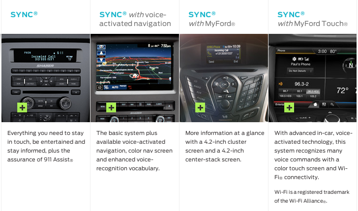
Model 2 — Custom HMI modules that use software platforms like [Microsoft Embedded — Automotive 7' or Blackberry’s QNX to manage and integrate different devices and sensors in a car into one platform. For example, Ford used Microsoft’s platform for their relatively long running ‘Ford Sync’ HMI systems. In this model custom interfaces for drivers are created, which means that the status quo, with fragmentation of interfaces and experiences, still remains. However, the inherent independence allows for the creation of custom experiences for users while being agnostic to the driver’s mobile device.
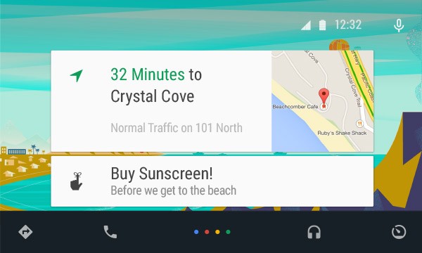
Model 3 — Integration of same-platform devices to onboard HMI, as done by Apple and Microsoft. While this might mean less fragmentation of operating systems, the user is wedded to one platform both in-car and in everyday life if they want everything to integrate.


Apple, Ford, Android and others — are targeting the car as the next frontier for mobile development.
So which model of connected car is best?
Model 3, while exciting, is borne of different motives to Models 1 and 2. Apple, Google, Microsoft et al are all looking for a gap in the market or, more precisely, an extra touch point in which to sell more devices. The design community may well be all fired up designing apps for cars, but what are the potential pitfalls of an app-based approach?
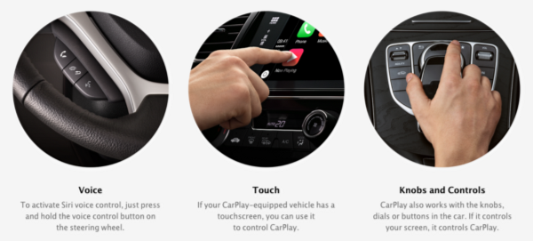
First and foremost, drivers are beholden to a hardware/software manufacturer. To make Apple CarPlay work on the Mercedes Benz C-class, the driver has to plug in their iPhone. Similarly, to use ‘Auto’ you’ll need an Android phone. Will people start to choose cars based on their handset of choice? 
Compounding this phenomenon, car manufacturers seem all too keen to jump into bed with these initiatives — Honda, Audi, General Motors and Hyundai, to name but a few, are already members of Google’s Open Automotive Alliance (OAA).
There’s a “me too” sense of urgency too; it’s quicker and more scalable for Apple, Google and Microsoft to get their existing platforms into existing cars, than to create tailored solutions in a fragmented market. Car manufacturers benefit too — not only do they save on HMI costs, they also benefit from the fast pace of technological advancement in the mobile and software space. Lengthy automotive design process cycles would otherwise hold back the integration of a contemporary HMI, as pointed out by Vera Schmidt, Senior Manager of Advanced UX Design at Mercedes:
If you have (HMI) ideas now and you want to bring it to the vehicle soon, we try to accomplish it with this team by taking advantage of mobile devices and connecting them to the car to bridge that gap. Vera Schmidt, Senior Manager of Advanced UX Design at Mercedes (source)
And speed is of the essence — these companies, software giants and automotive stalwarts alike, need to establish their presence in this field as quickly as possible if they’re to get ahead of the trend.
In the short term at least, Model 3 may be the quickest and most viable way of getting a contemporary UI into a car by providing better usability and consistency across car types. It also plays into people’s behaviour and the ways smartphones are already being used — for instance using Google Maps instead of traditional Sat-Nav via a cunning dash-mount hack. 
But there are obvious drawbacks to Model 3, which might hold them back:
Given the lengthy production cycles and that purchase cycles are less than one vehicle per two years, it will take many years for the model to become truly pervasive. According to estimates from GSMA and others, by 2018 there will be over 60 million connected cars on the road globally, driving some £30 billion ($51 billion) in annual revenue. That’s just 6% of the cars on the road, which surpassed 1 billion in 2010 (according to a study by Ward’s Auto).
Being beholden to a certain hardware/software provider, might be detrimental to user experience. For instance, demos of Apple’s CarPlay system speak about the use of the iPhone in a car. It predetermines the use of a certain kind of device and an understanding of the idiosyncrasies of that operating system, which would make sense only for Apple users. What we actually need is synchronisation across multiple platforms to be more inclusive across world markets.
Updates to mobile devices should happen at an equal pace to that of the in-car HMI (hardware and software). Update patterns in consumer mobile devices cannot carry over into cars, since that could present safety issues. Rules need to be communicated to independent app makers who wish to develop software for cars.Similarly, we need to consider the rapid change in mobile hardware in comparison to the car in itself. Cars are meant to last for years and mobile devices/software reach obsolescence far sooner. Would this mean a new paradigm in replaceable and modular HMI?
Access to deep telemetric data and control systems of the vehicle (eg seat positions, remote ignition control) in an app-based model could prove difficult with regards to driver and passenger safety and security. Regulations will need to change quickly to suit this reality. (See Hacking into the Tesla S).

We feel that these are just some of the challenges that need to be overcome in order for this model to be truly viable and attain any level of meaningfulness.
This leads us on to the radically connected car and custom module HMI car, outlined in Model 1 and 2 respectively, which use a bespoke, integrated HMI approach. This could be a better more meaningful long-term option, but like Model 3, also has some existing issues.
Black & blue
In the first and second model, car manufacturers’ internal design teams create their own “tailored” HMI (though often the GUI and even physical buttons are repurposed from vehicle to vehicle). The screen and, more recently, the multi-touch screen seem to be the default thought on HMI problem solving today.
In his article The State on In-Car UX, Geoff Teehan does not exude confidence in this approach. Contrary to Geoff Teehan’s opinion, we believe the model itself does have some potential (discussed later), but is currently poorly executed.
For those (automotive) manufacturers looking to go it alone, I don’t expect much.
The problem with current internally designed in-car HMIs is that they either look hard to use or they are hard to use (probably the same thing) — and let’s not even get started on Pixel Perfect Precision.
They are often very moody and dark, with neon blue highlights and metallic textures. This creates another problem: they have an overtly masculine or sci-fi aesthetic which can alienate both women and men. The UI’s approachability is thus often daunting, intimidating and unintuitive — the exact opposite feelings that they should evoke. And then there’s the fact that they all end up looking the same.
HMI UIs have their fair share of practical, legal and safety constraints, of course, which can make a designer’s job very difficult. However, if we put that aside for one moment, it is fair to say that current HMIs have no aesthetic beauty, no identity of their own, no character. They are an ugly, utilitarian, emotionless afterthought; a seemingly out of character approach for automotive companies that expend so much effort on exteriors and interiors.
Branding: a missed opportunity
This “black and blue” aesthetic seems to be born out of a separate design stream to that of the rest of the car and indeed the larger brand.
As with almost all companies in the world, automotive companies have strict brand guidelines on which they base all of their communications, from logo treatment and typography to specific brand colour values. You can imagine that a Ferrari brochure would feature lots of red, as would a Ferrari website, a Ferrari app and so on. Why then, does the centre console of the HMI from the Ferrari California 2008 feature no red, but instead lots of blue (admittedly, the selected hardware is restrictive)?
We are not suggesting that HMI should necessarily follow brand books religiously, but we do feel that there is a wasted opportunity here. HMI should take inspiration from the entirety of the car, not just in the choice of colour, but in other aspects of both form and function - this is the point in which we interact with their product after all.
There’s real potential in blurring the lines between the exterior, interior and HMI design of a car, creating a coherent user and brand experience, from the colours to the look and feel, to interactions. With that in mind, neither the blue of the HMI in the example above, nor the square shape nor the cold, dry look and feel, fit in with the warm, sporty and exciting interior and exterior of the car.
The use of skeuomorphism in many car HMIs is primarily based on a need to solve the lack of affordance and feedback offered by the screens that have replaced buttons (as discussed in Part 2). However, this skeuomorphism seems to bleed into the entirety of the interface, which again pushes any branding into the back seat.
Skeuomorphism: It’s not all bad
An aesthetic common in current automotive HMI UI’s, and indeed with many UI’s of the past decade, is skeuomorphism.
However, unlike contemporary UIs, the in-car HMI has failed to move with the times and shed the skeuomorphism — perhaps an artefact of the lengthy car production cycles we discussed earlier.
We’ve always thought skeuomorphism was too generic a term though, preferring instead to split this term into two types; stylistic skeuomorphism and semantic skeuomorphism. 
To explain, let’s take a random button from a UI. Using stylistic skeuomorphism you might give it a glass texture, perhaps some bevels around the edges, maybe even some light reflections and glare. While this may help it look more like a physical object, it’s not necessary for the understanding of the function.
However by applying semantic skeuomorphism to that same button, you can imply that the button has depth, which helps communicate that it is pressable. This simple shadow or edge adds an ‘affordance’ to the graphical user interface, which is pivotal in helping users find operational cues. (We cover this in more detail in our ustwo PPP document for best practices in GUI.)
‘Affordance’ is an object’s ability to convey its function through sensory means, for example a button suggests that you press it by being slightly raised; This technique can also be used in digital design to lead users into interacting with objects.
Semantic skeuomorphism works with visual metaphors to communicate a meaning, much like many icon designs. For example, the attachment ‘paperclip’ icon in email clients: it’s not an aesthetic style, nor is it literally demonstrating the function. It is a metaphor that effectively communicates the function — which is now so well-known that is has been adopted as a standard. 
Within today’s car dashboard, skeuomorphism also manifests itself in these two distinct ways. Just as skeuomorphic UI buttons look like analogue buttons of old, car HMIs are derived from a legacy of analogue or mechanical interpretations of pre-digital car dashboards.
The first, stylistic skeuomorphism, presents itself in the form of metallic sheens and bezelled graphics. This only acts to compound the masculine or sci-fi look we discussed earlier. You could argue that this aesthetic is informed by the materials used within the car’s interior, or that in fact the faux leather and wood effects are a form of skeuomorphism themselves. Regardless, the styling, the blurring of the line between the design of the car itself and that of the UI is something we find interesting.
The second, semantic skeuomorphism, is apparent in the familiar speedometer. 
The early speedometers worked directly from the engine: a cable connecting the two pulled the pin left or right depending on the exertion put upon the engine. Though these mechanics are no longer used, the same method to communicate velocity is still adopted in nearly all cars. Is a dial pointing at a number really the most effective way of communicating a driving speed?
There is an argument that it signifies a relative position — akin to ‘How many minutes to 2'o clock?’ as seen with traditional watch-faces. But there are new and more relevant measures for speedometers now, such as ‘How close you are to the speed limit?’ So, it is, in a way, a legacy; the familiar representation carried over from a time when that method was the best approach within technological and mechanical constraints.
The familiar is a powerful signifier of meaning. Just look at the paperclip example discussed earlier. However, learned behaviours and new signifiers are being adopted all the time, especially in this era of the rapidly evolving smart device, and especially if they’re efficient, a pleasure to use and easily understandable. The transformation from the skeuomorphism of iOS6 to the flat, motion oriented design of iOS7 is an obvious example.
So, the current state of in-car HMIs suffers largely from the emergence of the screen and the multi-touch screen in the in-car environment, or more precisely, the poor appropriation of the technology. Car manufacturers’ eagerness to use the screen as a solution to mapping and learnability problems has meant that new problems have emerged in the infancy of its adoption.
As this technology continues to advance and the experiences mature, we may start seeing some changing patterns in in-car HMI that finally make sense.
In Part 4 we will look ahead into the near future of in-car HMI, specifically through the lens of technical possibility.